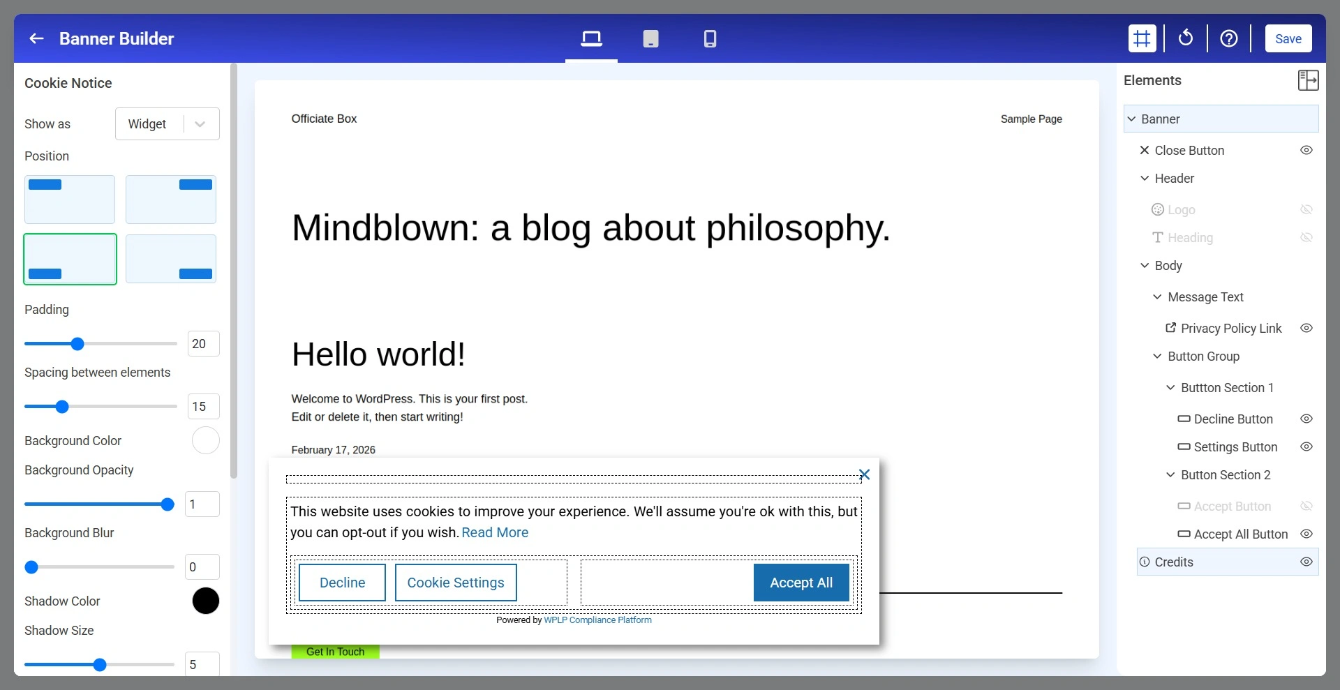
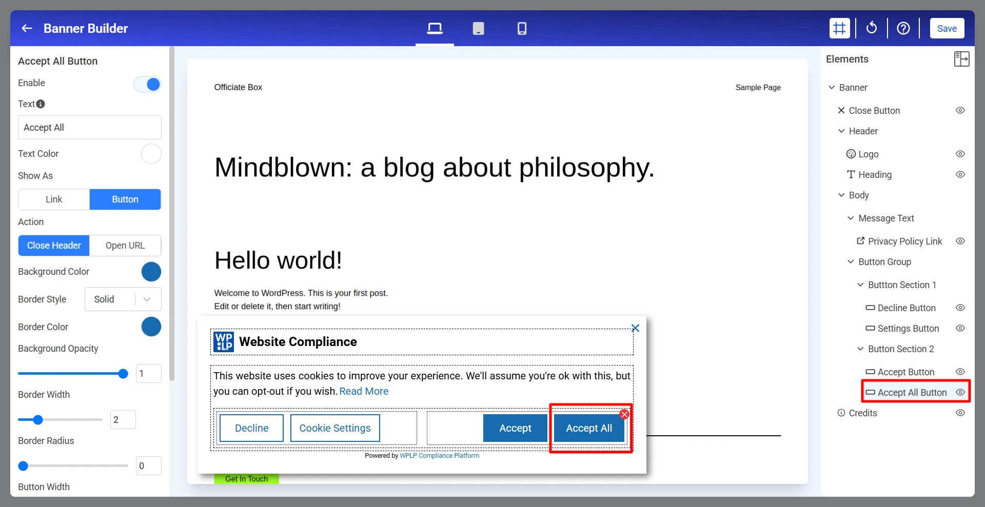
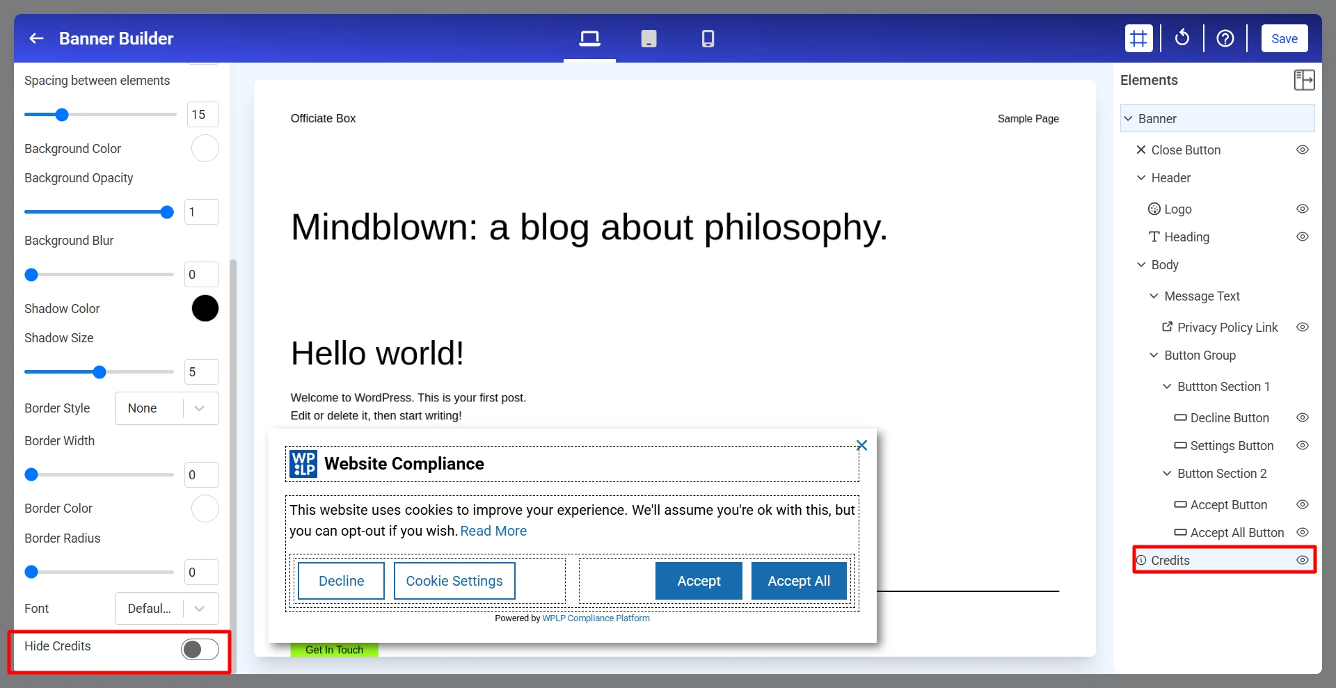
The Cookie Banner Builder allows you to visually create, customize, and manage cookie consent banners without writing code. Using the live preview and drag-and-drop interface, you can configure banner layouts, consent messages, privacy policy links, buttons, colors, spacing, typography, and responsive behavior.
To access the Cookie Settings section:
app.wplegalpages → Cookie Consent → Cookie Settings → Scroll Down
1. Cookie Notice
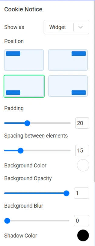
The Cookie Notice section controls the overall appearance and positioning of the cookie banner.
Below are the Cookie Notice settings.
Show As: Determines how the cookie notice is displayed.
Position: Controls where the cookie notice appears on the website.
Padding: Controls the internal spacing between the content and the edges of the banner.
Spacing Between Elements: Controls the space between banner elements such as logo, heading or message text.
Background Color: Sets the background color of the cookie notice.
Background Opacity: Controls the transparency of the banner background.
Background Blur: Applies a blur effect behind the cookie notice.
Shadow Color: Defines the color of the banner shadow.
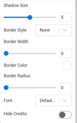
Shadow Size: Controls the intensity and size of the shadow surrounding the banner.
Border Style: Controls the border appearance.
Border Width: Adjusts the thickness of the border.
Border Color: Defines the color of the border surrounding the banner.
Border Radius: Rounds the corners of the cookie notice.
Font: Selects the font family used throughout the cookie notice.
2. Close Button
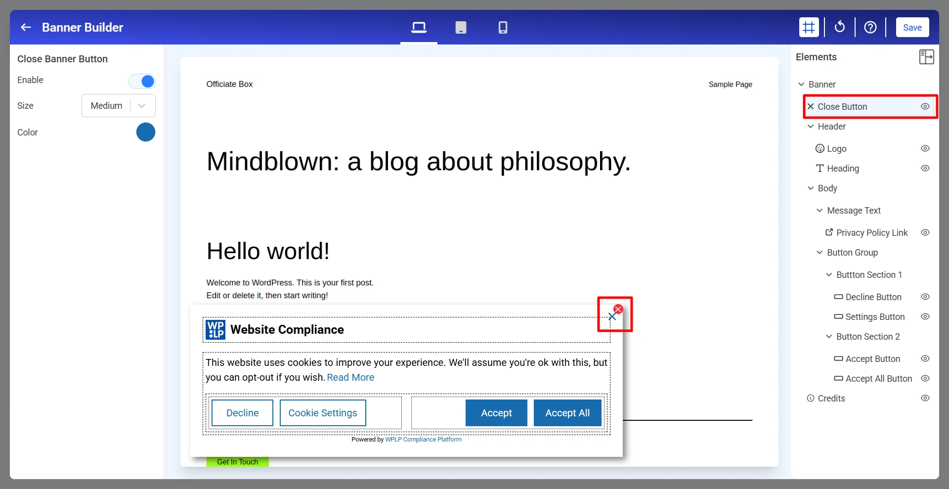
The Close Banner Button allows visitors to dismiss the cookie notice without interacting with the consent buttons.
Enable: Show or hide the close button (×) in the cookie notice.
Size: Controls the size of the close button.
Color: Defines the color of the close button icon.
3. Logo For The Cookie Banner
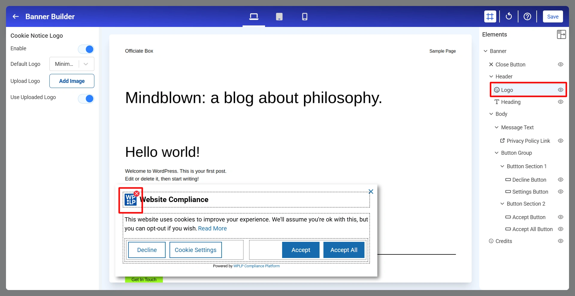
The logo appears in the header section of the cookie notice and helps reinforce your website branding.
Enable: Show or hide the logo.
Default Logo: Select one of the available built-in logo styles.
Upload Logo: Upload your own custom logo image.
Use Uploaded Logo: When enabled, the uploaded logo replaces the default logo.
4. Heading Of The Cookie Banner
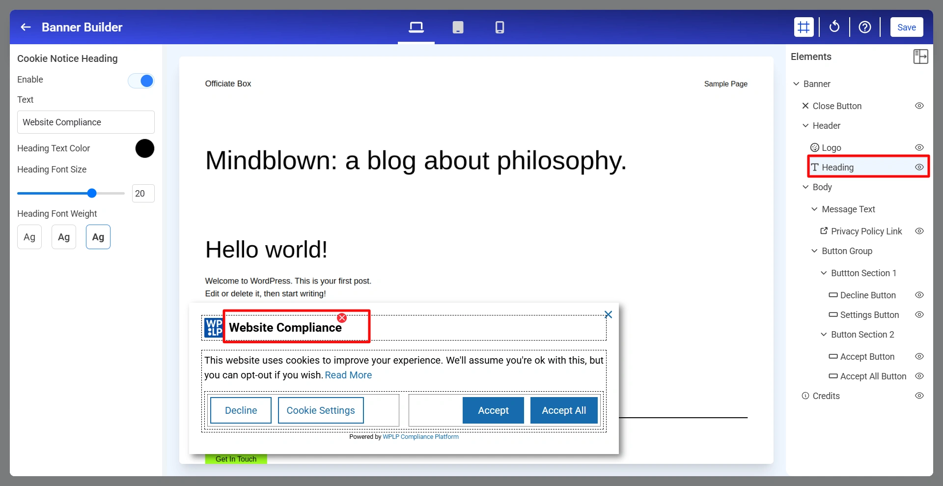
The heading serves as the main title of your cookie notice.
Enable: Show or hide the heading.
Text: Defines the heading text displayed to visitors.
Heading Text Color: Controls the color of the heading text.
Heading Font Size: Adjusts the heading size.
Heading Font Weight: Controls the thickness of the heading text.
5. Message Text For Banner
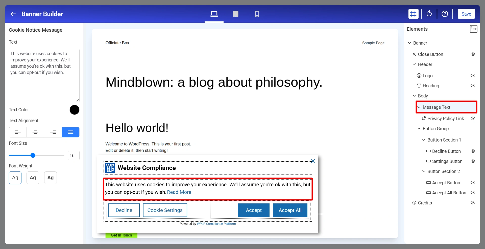
The cookie notice message explains how cookies are used on the website.
Text: Enter the message displayed to visitors.
Text Color: Defines the color of the message text.
Text Alignment: Controls how the message is aligned.
Font Size: Adjusts the size of the message text.
Font Weight: Controls text thickness.
6. Privacy Policy Link
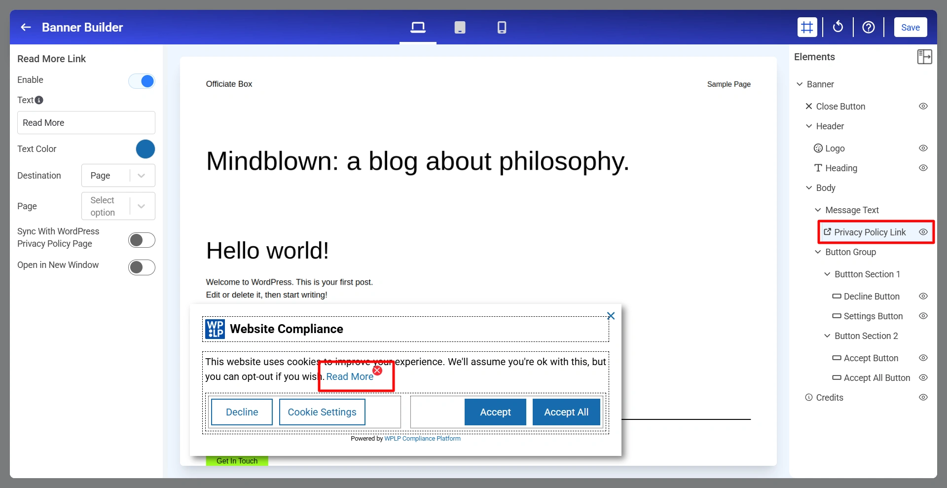
Allows visitors to access your Privacy Policy directly from the cookie banner. To customize the Privacy Policy Link, click Privacy Policy Link from the Elements panel.
Enable: Turn the Privacy Policy Link on or off.
Text: Defines the text displayed for the link.
Text Color: Controls the color of the link text.
Destination: Determines where the link directs visitors.
Page: When the destination is set to Page, select the page visitors should be redirected to after clicking the link.
Sync With WordPress Privacy Policy Page: Automatically uses the Privacy Policy page configured in WordPress.
Open In New Window: Controls whether the selected page opens in a new browser tab.
7. Decline Button
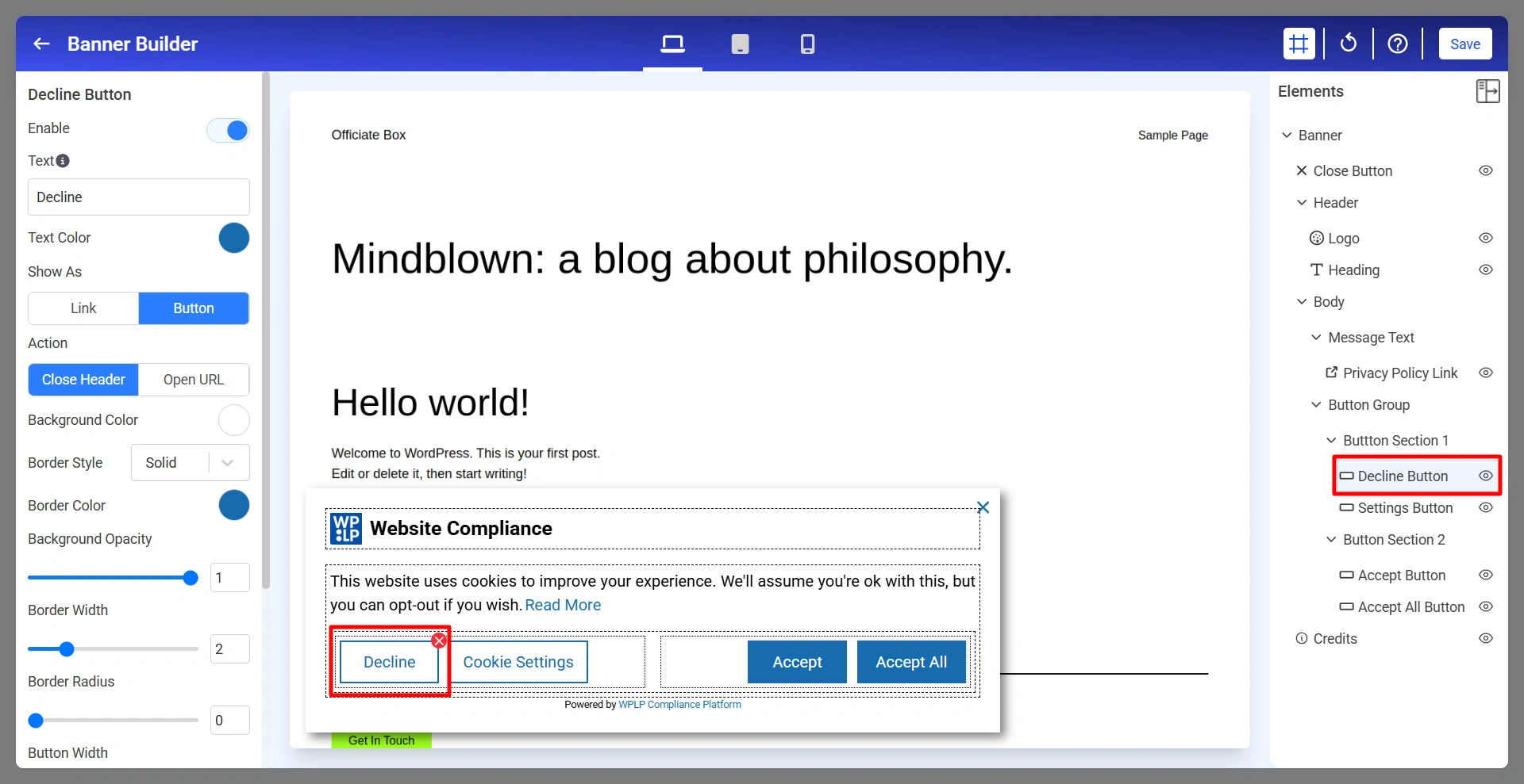
The Decline Button allows visitors to reject cookies according to your consent configuration.
Below are the Decline Button settings.
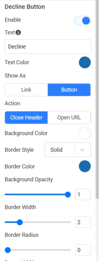
Enable: Show or hide the Decline button.
Text: Defines the label displayed on the button.
Text Color: Controls the color of the button text.
Show As: Determines how the action is displayed.
Action: Determines what happens when the button is clicked.
Background Color: Sets the button background color.
Border Style: Controls the border appearance.
Background Opacity: Adjusts the transparency of the button background.
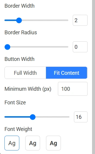
Border Width: Controls border thickness.
Border Radius: Rounds the corners of the button.
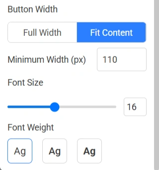
Button Width: Determines button sizing.
Minimum Width (px): Sets the minimum width of the button.
Font Size: Adjusts the button text size.
Font Weight: Controls the thickness of the button text.
8. Settings Buttons
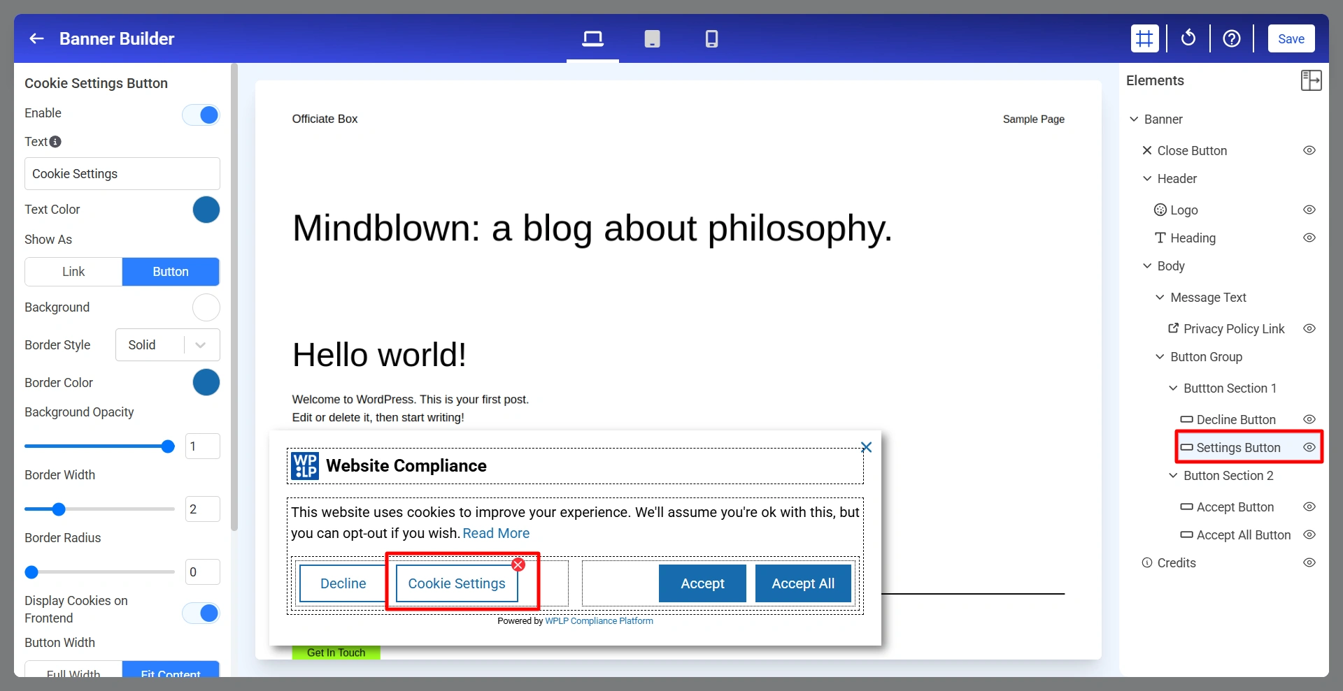
The Cookie Settings Button allows visitors to access detailed cookie preferences and manage consent choices.
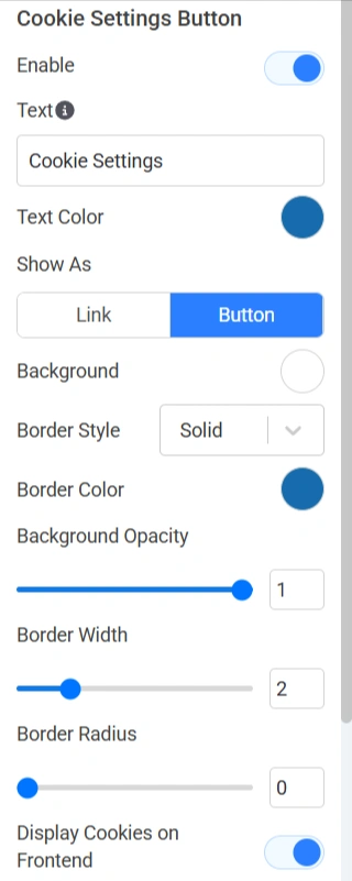
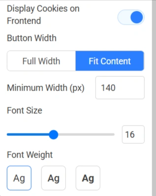
Below are the Cookie Setting Buttons.
Enable: Show or hide the Cookie Settings button.
Text: Defines the button label.
Text Color: Controls button text color.
Show As: Choose whether the control appears as link or button.